 What does nearly every great rock band have in common? A great brand identity.
It’s never about the music in rock’n’roll. It’s about image, showmanship and identity, and some of your favorite acts have built their reputation on iconography and a mythos that’s as cool as their songs. Heck, there are even a lot of questionable bands who, thanks to some underappreciated designer and a fabulous bit of branding, have great identities. Setting aside musical tastes and merits, OTM dissects some of the best rock band brands.
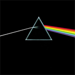 Pink Floyd: During its Roger Waters-fronted glory days, no band encapsulated the mystery of the psychedelic movement, the determination of the counter-culture and the outright drugginess of its era like Pink Floyd did. While its Dark Side of the Moon cover art was never an official logo, it encapsulates all those elements so perfectly as to be one of the most iconic images in rock history. Simple, effective and able to stand alone without type, it’s the visual of one of rock’s most compelling outfits.
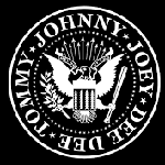 The Ramones: The punk era produced more than its share of great band brands, but The Ramones’ logo truly stands above the crowd. As the quartet sported a hyper-American brand of noisy buzz-saw guitar, and T-shirt and jeans minimalism, the brand captured everything perfectly. Riffing on the American seal and incorporating the classic “Hey Ho, Let’s Go” mantra from “Blitzkreig Bop,” it’s instantly familiar while showcasing everything about the band’s no-frills esthetic.
 Weezer: Before Weezer was cool, Rivers Cuomo was the champion of downtrodden nerds everywhere. When his grunge contemporaries were slinging sludge, he embraced power-pop – and the antithesis of early-’90s cool. His act’s logo does the same: At first glance, the old-school flying W design is straight-up tacky, a little gross and exactly the sort of thing a 15-year-old would dream up for his first band. Understanding that’s key to early-years Weezer’s psyche.
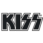 Kiss: The Kiss logo is proof that a logo doesn’t have to be great to be iconic. By 1973, the beveled-edge typeface had been beaten to death by the first generation of metal bands and the pair of blocky, malformed S’s border on typographical malpractice. Combined with the band’s outright zeal for merchandising (and its fans love for that merchandising) it’s come to adorn T-shirts, action figures, cologne, a checkers set and, yes, even a coffin. It just goes to show that with tenacious marketing, any logo can do good.
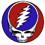 The Grateful Dead: To include the Steal Your Face lightening-and-skull logo on this list or not? That’s the question. Pro: The logo’s possibly one of the most celebrated rock-band marks in history, and is simple and iconic. Cons: The mark seems to fit some bad-assed, sweaty hard-rock outfit, not a gaggle of merry pranksters playing jam rock. Chalk it up as a great logo, or a great example of brand dissonance? It’s up to you.
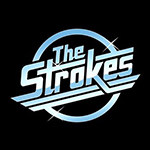 The Strokes: Coming seemingly out of nowhere at the turn of the century, The Strokes single-handedly made New York indie rock a worldwide phenomenon. While the band’s Velvet Underground-styled rock took great pains to look off-the-cuff and spontaneous, a deeper dive into the music revealed the act was obsessed with details. Marathon practice schedules, a look developed by a stylist, songs engineered to leverage pop structures: It was as well considered as any prog-rock’s sound. The airbrushed chrome logo is just the same: While simple and seemingly basic, it reveals the band’s love for stylish approaches.
Are these the only great band logos? Absolutely not. Are there great rock bands without the best rock band brands? Certainly, but when the world of music and branding come together it’s music to our ears.
