|
Getting your Trinity Audio player ready...
|

In this post I am going to explain what branding is and what it is not – your logo is not your brand.
At the end of 2017 I decided that I needed to try something new, something to push me just a little bit further as a creative professional.
I’ve been working in the marketing industry for about a decade now and while I’ve loved every moment of it, sometimes I just feel like I need a little bit of a creative push to get out of my own way.
So… I signed up for Seth Godin’s, The Marketing Seminar.
As the website for The Marketing Seminar reads, “The Marketing Seminar teaches you something you didn’t think you needed to learn, but then, quite suddenly, you’ll wonder how you got along without it. It helps you see what’s possible, connects you with others going in the same direction, and gives you the foundation to do the work you’ve always wanted to do.”
I’ve been thoroughly enjoying The Marketing Seminar over the past few months and I’ve made a lot of discoveries along the way – specifically about Old Town Media, how we’re different and how we should be looking at our clients’ goals and problems through a much larger lens.
Recently, one of the lessons broached the topic of branding and how most people don’t know what branding really means. This struck a chord with me because we receive a lot of inquiries about businesses needing a “logo designed” so that they can establish a brand for their business – but in reality, a logo is not the equivalent of a brand.
A logo is a visual, it’s important and it can be really fun to create, but it’s not a brand.
As Seth Godin puts it, “The brand is the sum of the promises we make, the story we convey, and the expectations that we want customers to believe we will fulfill.”
Your brand is the sum of all parts: it’s your story, it’s how you package your product, the color that you use, the photos that you choose and the emotions that you, your product or your service evoke from people – and why.
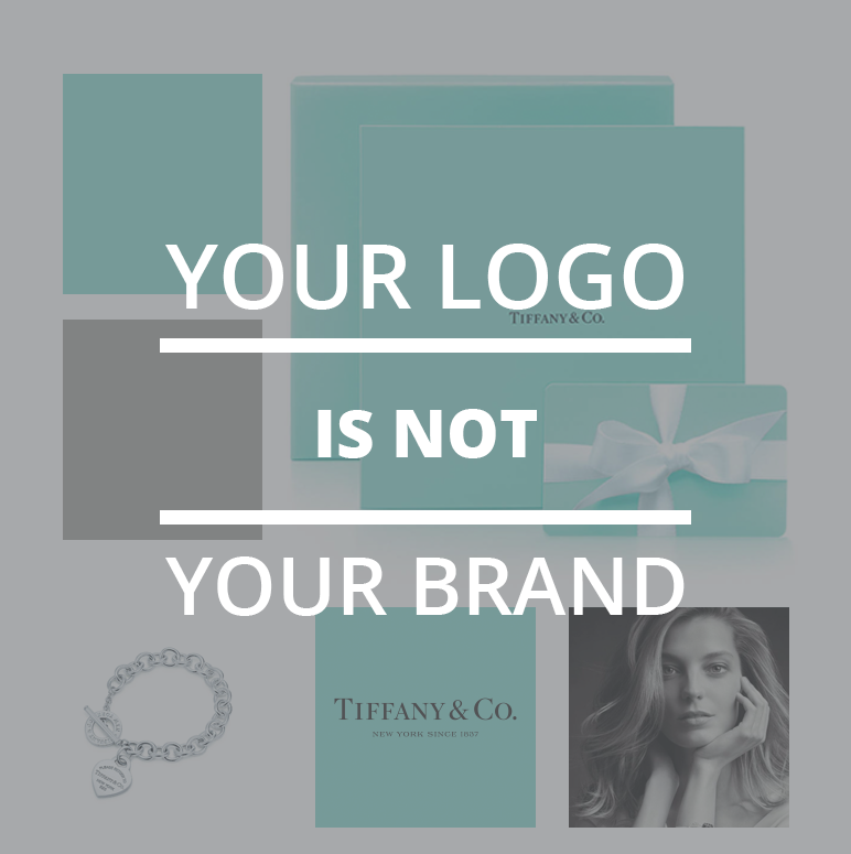
When I really started to think about this, I started to think about all of the brands that I am acutely aware of but that I do not associate with their logo or logomark. One of the brands that came to mind was Tiffany & Co. Not only did I have no idea what the Tiffany & Co. logo actually looked liked, but I have also never, ever purchased anything from them (because I like to afford to eat).
However, there were some things that I associated with the brand immediately:
- The blue color that has been notably deemed “Tiffany Blue”
(Has it been notably deemed that? I actually don’t know, but that’s my perception.) - The move Breakfast at Tiffany’s, which features Audrey Hepburn
(I have never seen this movie nor do I have any idea if it really is about Tiffany & Co…. again, perception.) - The price point is high, this is a premium brand that charges a premium for its product
(I do know this to be true.) - The Tiffany heart charm & regular use of locks in their designs
The brand itself, to me, stands for elegance and status.
People purchase jewelry from Tiffany & Co. because it means that they can. It means that they can afford to buy premium jewelry and they feel as though they are a part of an elite group of people who care about premium jewelry and can afford it.
We can expect jewelry from Tiffany & Co. to come in a bright blue box and we can expect the diamonds to be real, the silver to be pure.
THAT is the Tiffany & Co. brand and THAT is not a logo.
Need help figuring out what your brand is? Give us a shout.
