ENCOMPASS
Encompass Technologies, an ERP solution for the beverage & food industry, is changing the industry by digitally connecting manufacturers, distributors, and retailers with SaaS solutions that streamline operations, simplify decision making, and equip business for success in a fast-changing and unpredictable market. Encompass came to OTM in 2021, one year after merging with Orchestra Software and acquiring Handoff Technologies, looking for strategic guidance on branding following the M&As. Through The OTM Path to Growth® and a series of branding exercises, OTM and Encompass launched the new Encompass brand, defined a scalable brand a hierarchy, and we continue to work with Encompass on branding its suite of SaaS solutions.
Brand Strategy & Design
Deliverables
- Brand Story
- Messaging House
- Brand Hierarchy
- Logo Design & Solution Design
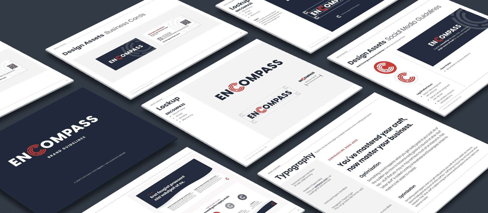
- Branding Guideline Design
- Go to Market Launch Support

Our
Approach
We started with The OTM Path to Growth® process where we created a foundational brand story, messaging house, and ultimately landed on a direction for the name (Encompass) and the strategy around the brand hierarchy.
From there, we engaged in a number of collaborative exercises with key members of the leadership team to develop a brand decision map that would guide future brand decisions.


Knowing that Encompass is positioned for growth, we wanted to create a repeatable process for determining what would happen if another M&A occurred.
That led us to the creation of our brand decision map, a decision-tree-style map that starts with one question and builds off of the answers until it lands in one of three branding directions (a custom brand, a solution extension with custom iconography, and a solution extension).
Considerations in the brand decision map include questions like, “will this solution ever have its own mobile application?” and “does this solution have well-known competitors in the industry?” with each question relating to a pain point or opportunity in the development of the brand.

RESULTS
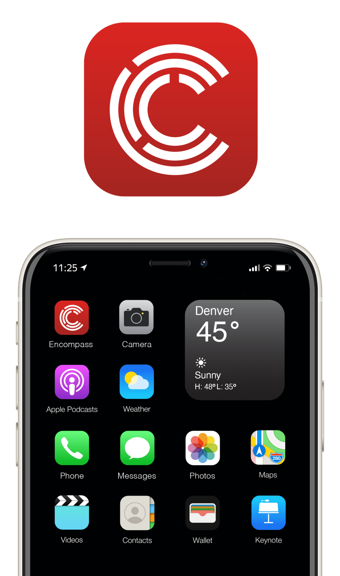
We ended up combining various elements of the previously existing Encompass and Orchestra brands, introducing a new, more modern font family, and leveraging the design of the C to tie in what was previously the O in Orchestra. Additionally, the three rings that make up the C are a nod to the three tiers of the industry that Encompass connects.
We decided to stick with red as the primary color as it is a color of passion and energy that motivates users to take action.
OTM and Encompass aren’t done yet, however. We’re currently working to evolve the brand into the next stage of growth, and we can’t wait to see what happens next.


